A speculative campaign proposal exploring how Amsterdam Wine Festival could move away from traditional wine aesthetics and become a younger, louder and more cultural city event.
Role
Art Direction · Campaign Concept · Visual Identity · AI Illustration Direction · Web & Social Design · Mockup Development
Art Direction · Campaign Concept · Visual Identity · AI Illustration Direction · Web & Social Design · Mockup Development
Tools
Midjourney · Photoshop / Figma · Mockup tools
Midjourney · Photoshop / Figma · Mockup tools
Note
Speculative concept. Not affiliated with Amsterdam Wine Festival.
Speculative concept. Not affiliated with Amsterdam Wine Festival.
Concept
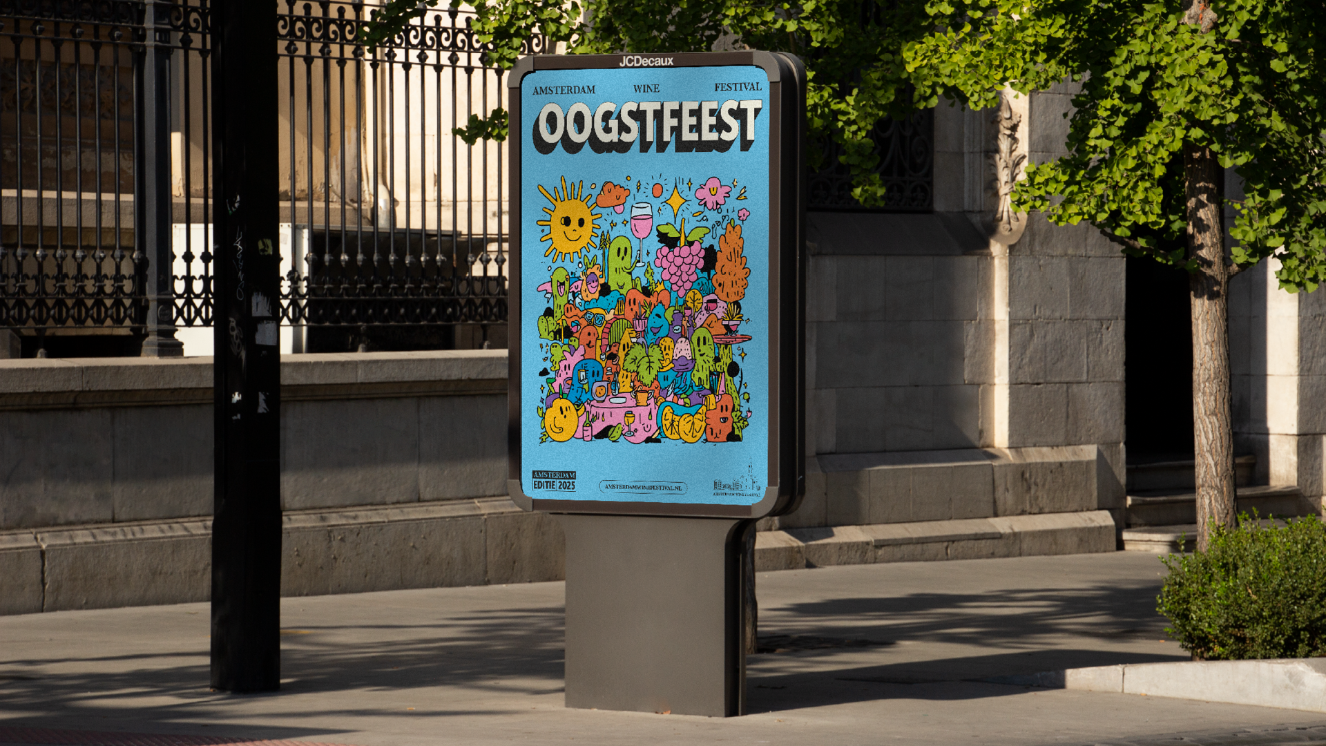
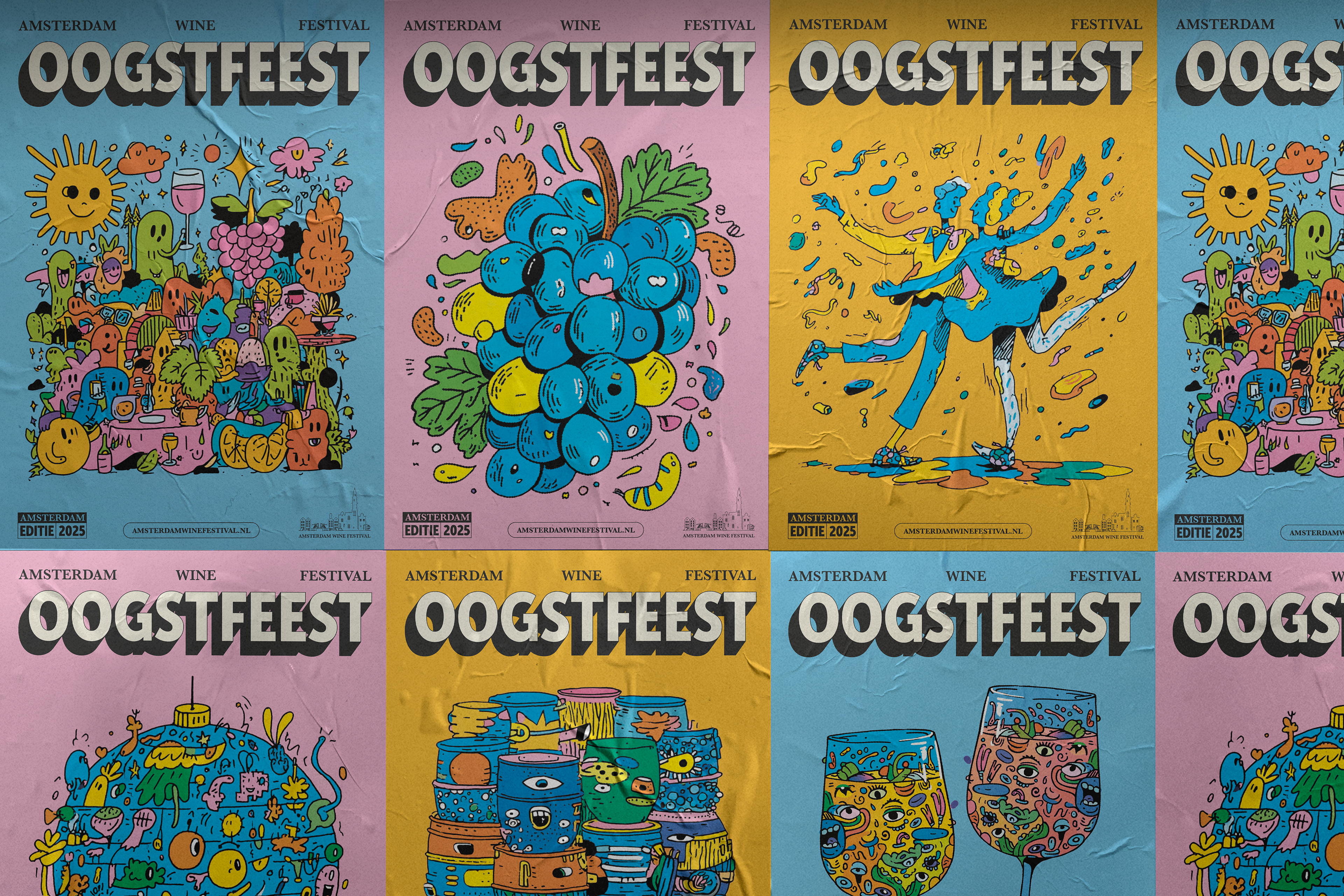
Oogstfeest means harvest festival. I used this idea as the starting point to create a visual world that feels celebratory, abundant and slightly chaotic.
The concept transforms wine culture into a party language: grapes become characters, bottles become illustrations, glasses become graphic icons and the festival becomes a visual explosion of taste, music, movement and people.
The direction moves away from the expected “premium wine” aesthetic and instead embraces joy, humor and impact.
Strategic Idea
Wine festivals often communicate through sophistication, heritage and elegance. This proposal challenges that convention.
The disruptive route asks:
What if a wine festival looked more like a cultural street festival than a traditional tasting event?
The answer is a campaign that feels younger, louder and more shareable, while still keeping the essence of wine: discovery, taste, celebration and togetherness.
Visual Direction
The visual direction is bold, playful and high-energy. It combines oversized typography, expressive illustration, bright colors and strong poster compositions.
The system is designed to stand out in the city and on social media. It does not try to whisper elegance; it creates immediate visual impact.
Visual keywords
Playful · Bold · Urban · Expressive · Colorful · Energetic · Social · Unexpected
Playful · Bold · Urban · Expressive · Colorful · Energetic · Social · Unexpected
Design System
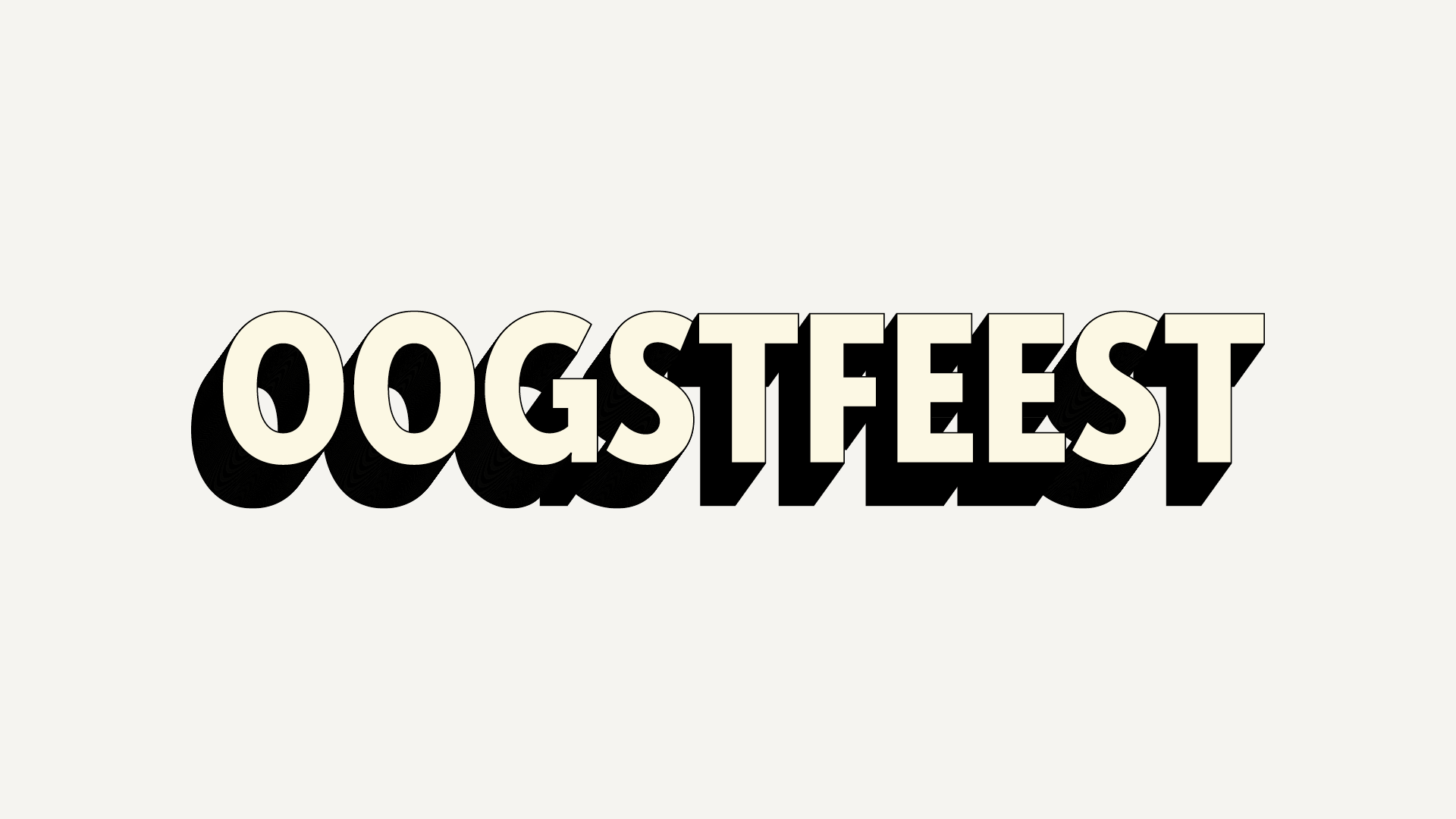
1. Bold Typography
Large, expressive type gives the campaign a strong voice and makes each poster instantly readable.
Large, expressive type gives the campaign a strong voice and makes each poster instantly readable.
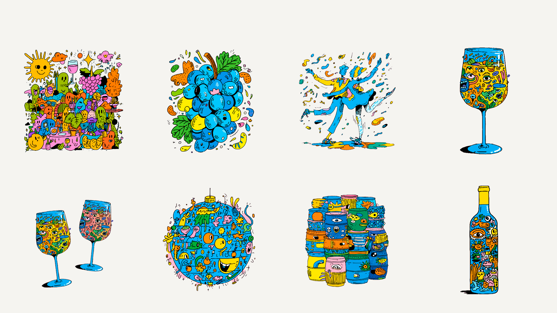
2. Character-like Illustrations
Wine, grapes, bottles and glasses are treated as playful visual characters, giving the festival a more human and memorable personality.
Wine, grapes, bottles and glasses are treated as playful visual characters, giving the festival a more human and memorable personality.
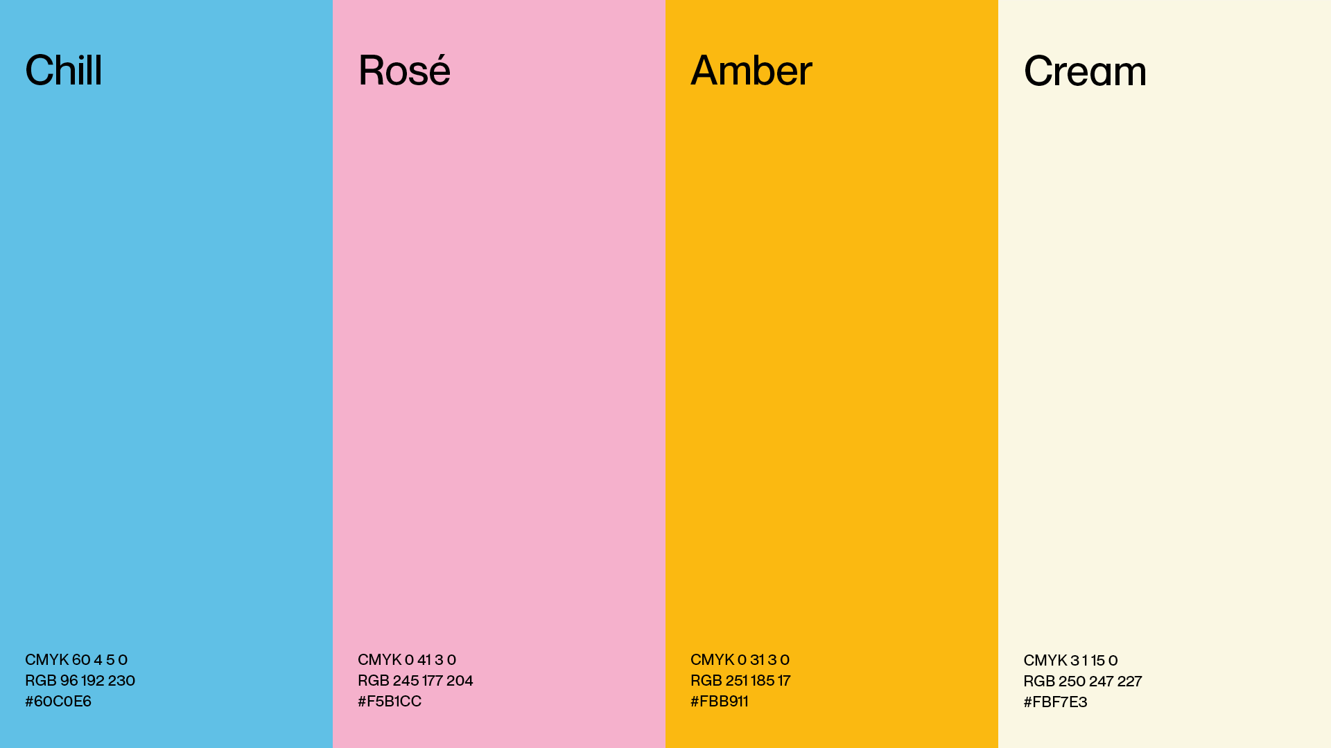
3. Bright Color Palette
The palette uses blue, pink, amber and cream to create contrast and freshness. It feels less traditional than wine red and beige, helping the festival reach a younger audience.
The palette uses blue, pink, amber and cream to create contrast and freshness. It feels less traditional than wine red and beige, helping the festival reach a younger audience.
4. Modular Campaign Assets
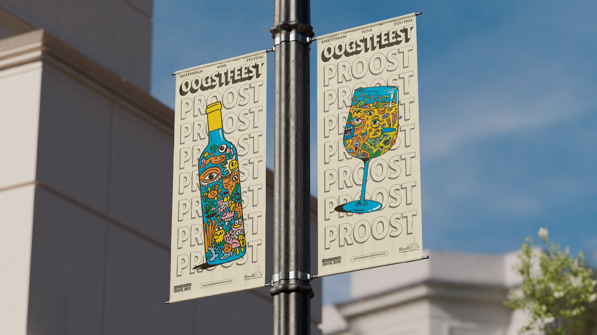
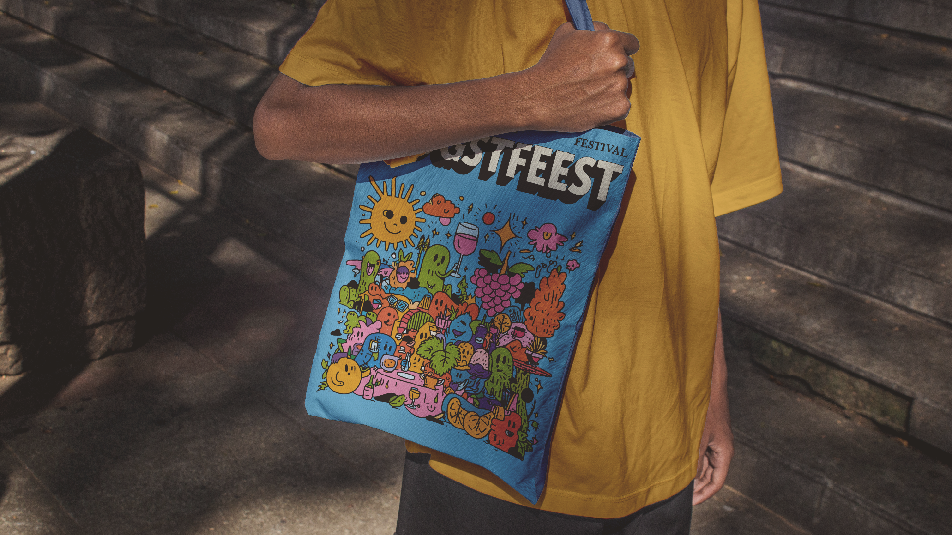
The illustrations can be used across posters, social media, merchandise, banners and digital platforms, making the identity flexible and campaign-ready.
The illustrations can be used across posters, social media, merchandise, banners and digital platforms, making the identity flexible and campaign-ready.
The illustrated assets were generated with Midjourney, then selected, refined and integrated into a broader campaign system.
The tone is direct, playful and festival-driven. It uses short, punchy lines that feel more like invitations than formal information.
Examples:
Oogstfeest
Proost. Proost. Proost.
Wine tonight?
Counting down. Start now.
Proost. Proost. Proost.
Wine tonight?
Counting down. Start now.
The language is simple, bold and easy to remember, matching the energy of the visual system.